New design affirms the brand’s commitment to helping customers #LiveCreatively.
Hoboken, NJ, USA

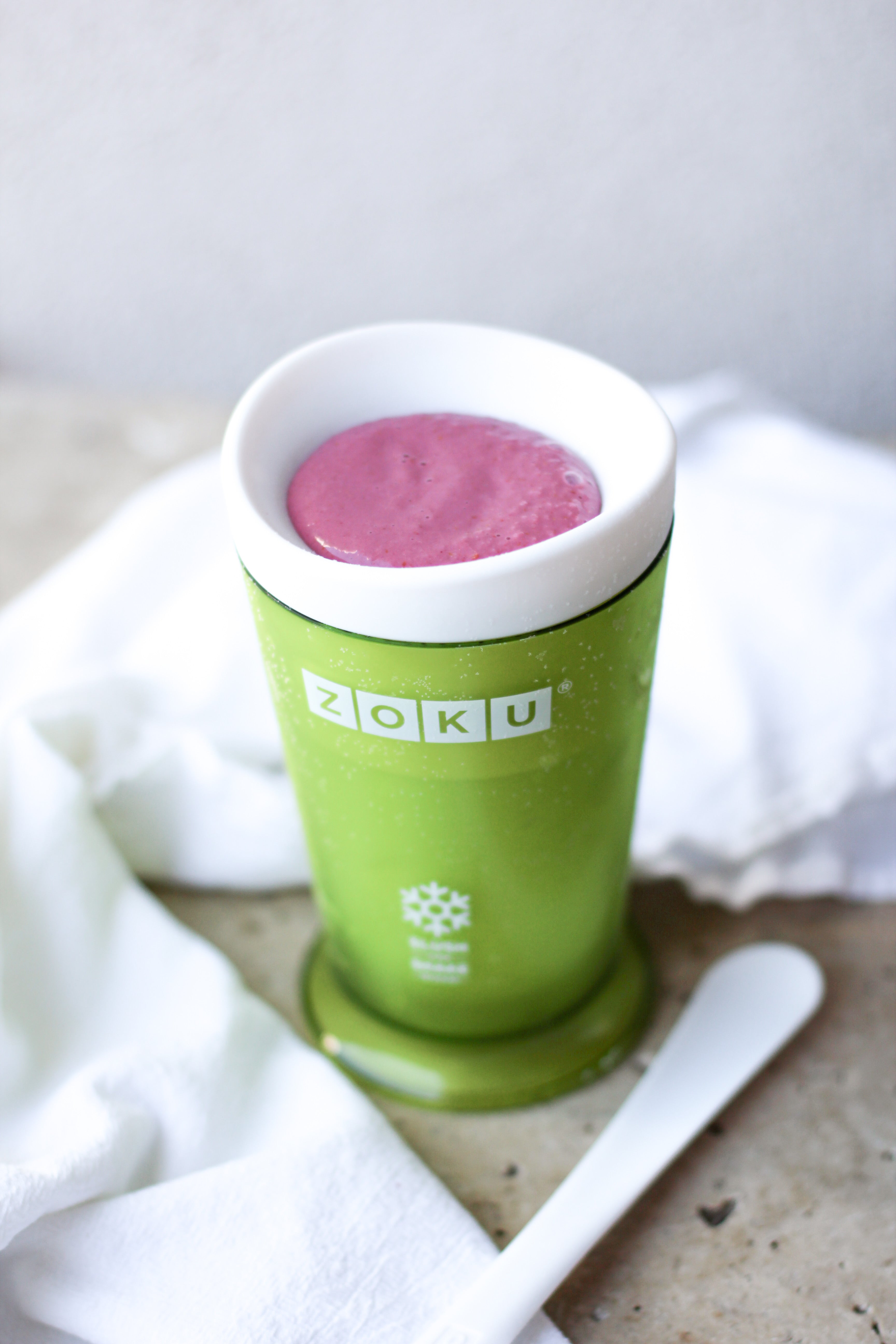
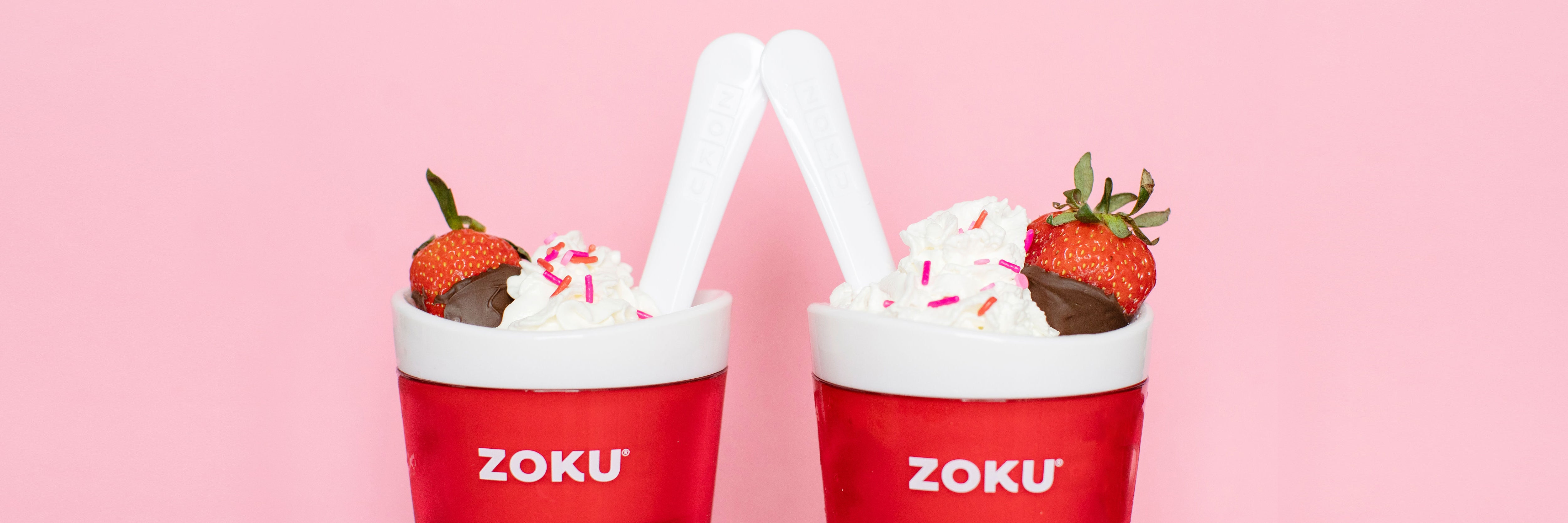
ZOKU, the design-led housewares company known for its innovative family lifestyle products, has unveiled a new logo as part of a rebranding initiative. The updated design is an evolution of ZOKU’s previous logotype and favors a slightly bolder typeface in the brand’s iconic red. While the new lettermark forgoes the former’s use of sequential boxes, its angular sans serif provides a cleverly timeless nod to its legacy.

The highlight of the refreshed logo is undoubtedly the bespoke “K,” which celebrates the company’s playful spirit and reputation for thoughtfully nuanced design.

Fans of ZOKU can expect the new look and feel to roll out gradually in 2021 across the brand’s various products and channels. “We are so excited to finally be able to share ZOKU’s updated look with our extended family of customers, distributors, and design-lovers,” said Ken Zorovich, CEO of ZOKU. “We’re a company that obsesses over the details, and this rebrand was no different – it’s the product of months of hard work and we’re very proud of the end result.”

ZOKU’s updated logo is also a functional move that quietly reaffirms the brand’s commitment to accessibility: The team sought a design that would improve readability across a range of physical and digital applications. The revised logotype smartly achieves this by subsuming the previous logo’s negative space, effectively increasing its size while staying within the constraints of the original aspect ratio.
In addition to being more legible, ZOKU’s new logo appears minimalist in the absence of the boxes which had previously encased the letters in its name. The result is a more breathable and boundless design which makes greater space for the ZOKU community. “We care deeply about our family of customers and distributors,” said Zorovich. “This cosmetic update is ultimately about inviting our community to bring even more of themselves to our brand. ZOKU has grown a lot over the past decade, but our mission has always remained the same: We exist to empower our ZOKU family to live creatively.”

ABOUT ZOKU:
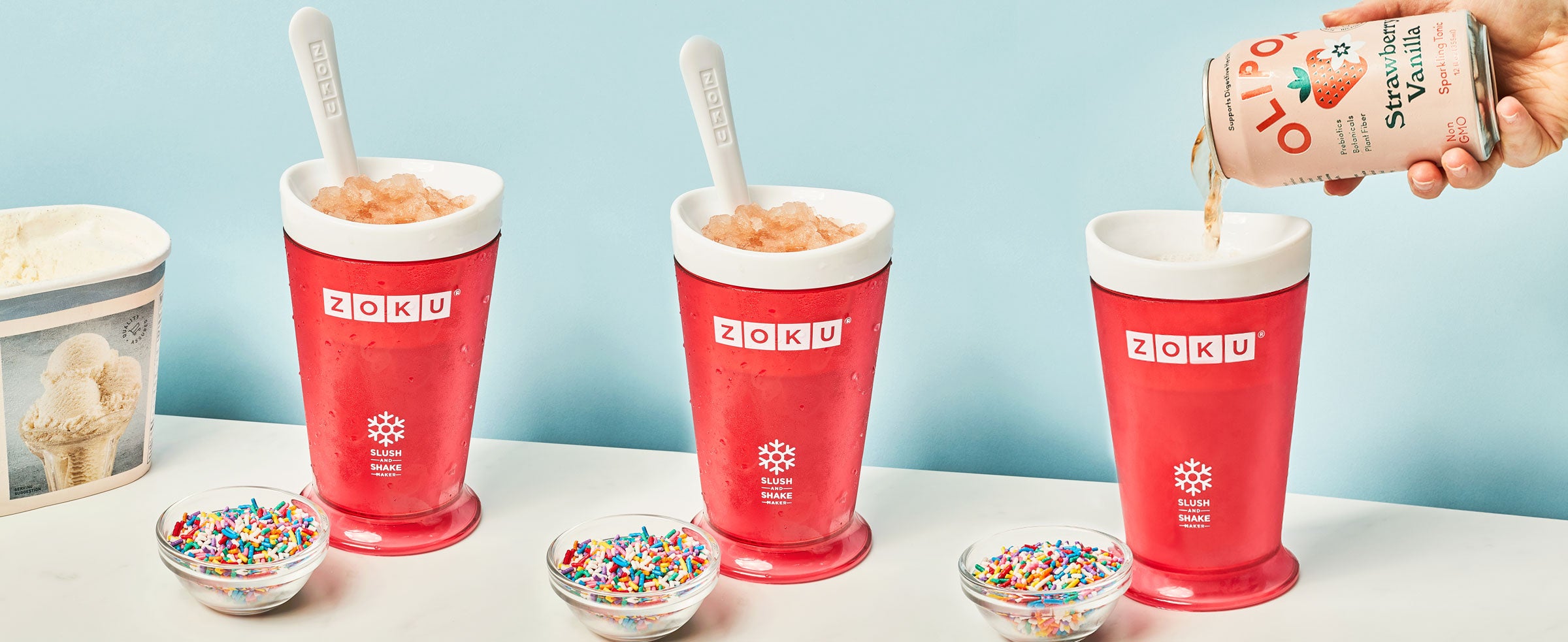
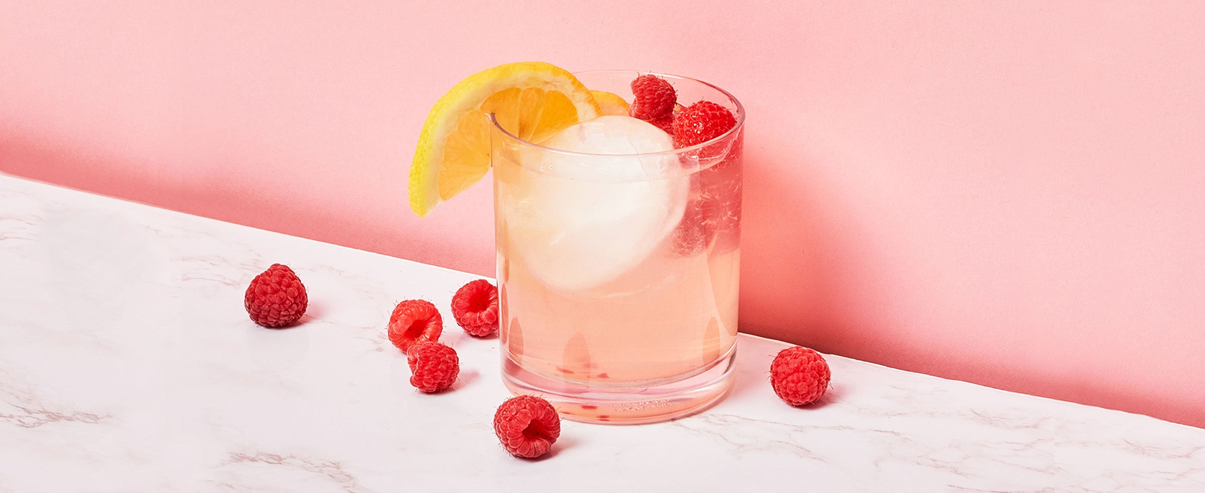
ZOKU is a family lifestyle brand known for its innovative household products that make everyday moments more meaningful. As a proponent of thoughtful design, ZOKU seeks to strike a balance between beauty, functionality, and sustainability through its wide range of products which includes drinkware, frozen treat makers, and sustainable solutions. To learn more, visit zokuhome.com.


Share: